T
This tutorial will walk you through pattern and action creation in Photoshop. I created this tutorial because I have been getting questions about my own UV grids. IN addition, I am a firm believer in automation. So to me, setting up a new UV grid every time need one is tedious. However, if you take a kitbashing approach, and define patterns and shapes you can use, and automate puuting them all together via Photoshop actions, you can tailor grid to your needs in minutes.
This tutorial was created in Photoshop 2019. However, I created my first UV Grid in Photoshop over ten years ago using this workflow, and I can safely say that if you are on older Photoshop versions, the workflow is pretty much the same, except maybe Snap and the Adobe Colours tip at the bottom of the page - I took care to not use newer functions.
As to why you'd need a UV Grid, it's because when you’re done modelling, you’ll need a good UV texture grid to help you pinpoint stretch or flips on your model. Most UV applications ship with a black and white checkered map, which is fine, but a basic map like that will often give you mediocre results. This is because no matter how finely you tile a checkered map, it won’t pick up on flipped UVs or other, finer distortions. By using a coloured and patterned UV grid, it’s easier to catch issues like those, because it’s the combination of patterns, letters and colours which does the trick.
Needless to say that if you have a game, still, VFX or animation model, finding all your topology issues before you add finer details in your texture(s) really matters - a triplanar node will not always compensate for bad UVs.
One thing that's worth noting that some people prefer to set up a hard 1K grid - 1000x100 pixels to match UV space and not their texture map at i.e.a 1024x1024 pixel grid. The workflow is the same for both formats, the only thing which differs is the size of the gridd and checker setups See the bonus tips at the bottom of the page to see suggested grid and checker sizes for both size-formats.
TL;DR
If you don't want to read or watch the tutorial, and just want the end result. The set was created in Photoshop 2019 (20.0.4)
- Download RizomUV Photoshop Patterns and Actions here
- Install Photoshop Patterns
- Install RizomUV Photoshop Actions
- Run Action 1, 2, or 3
- Boom! Easy peasy UV grid
Just give me the 1024x1024 grids, please
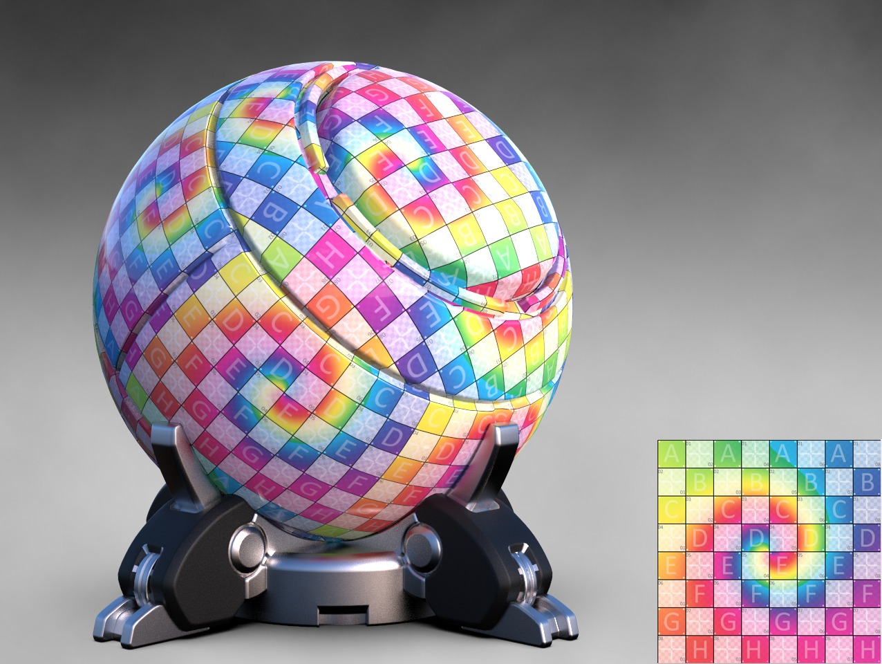
Like the UV Grid above?
Scroll to the bottom of the page for bonus tips and the How-To
Basic Pattern Creation
1 - Creating the grid and checkers
We're setting up a UV grid for a 1024x1024 document. See the table on the left for grid proportions and definitions. We'll be using transparency as much as possible because it just makes it easier on Blend modes. In addition, we're deleting the tile content for each size iteration we do on for grid lines and checkers. We'll be doing this, because Photoshop often generates a small blurry outline when scaling, and it’s just easier and faster to delete and redraw. Besides, you’ll only be doing it eight times, you’ll survive this
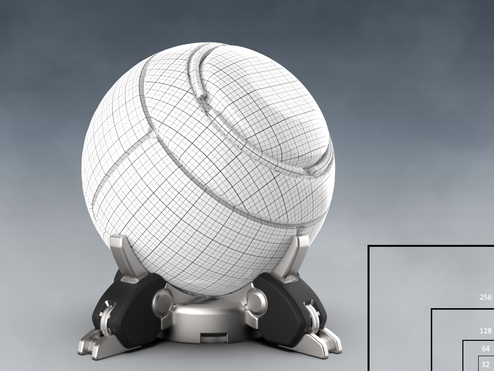
Gridlines
- Start by Creating a New Document – CTRL + N. Set it to 32x32 and Transparent. .
- Switch to Brush mode and set it to Pencil
- Set the pencil to 1 px.
- Draw one vertical line on the left-hand edge, and a horizontal line on the top edge. As we’re tiling it, all you need is two lines.
- Once you’re done, go to Edit>Define pattern and call it 32px Grid Transparent.
- Select all, press Delete.
- Go to Image > Image Size and set it to 64x64.
- Set Pencil to 2 px and draw a vertical and horizontal line on the edges.
- Then go to Edit>Define pattern and call it 64px Grid Transparent.
- Save the Pattern, Select all, press Delete.
- Set the Pencil to 3 pixels,
- and the image to 128 pixels
- Draw a vertical and horizontal line, and Define it as a pattern
- Save, Select all, and press Delete
- Set the image to 256 pixels, set the Pencil to 4 pixels
- Draw a vertical and horizontal line, and save as pattern.
- Save, select all, and Delete
Photoshop Shortcut reminders
- V = Move
- M = Select/Mask
- W = Magic Wand
- B = Brush
- G = Paint bucket/Gradient
- T =Text
- U = Shape/Custom Shape
- Z= Zoom
- Ctrl + N = New File
- Shift + F5 = Fill
- Ctrl + I = Invert
- Ctrl + J = Duplicate Layer
- Shift + Drag guide/Snap
- Ctrl + H = (un)Hide Guides
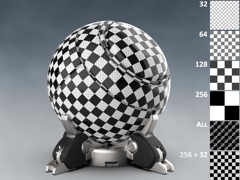
Checkers
- Delete the pencil lines.
- Create vertical guides at 8, 64, 120, 128, 136, 192, 248
- Create vertical guides at 8, 64, 120, 128, 136, 192, 248
- This will give you a set of squares and gutters to use for defining the checkers, shapes and letters.
- In the View menu, make sure Snap is enabled, as well as Snap To>Guides
- Place your cursor somewhere in the top left, and draw a square in the upper left part of the image from 0 to 128 on the horizontal and vertical lines. If you hold Shift, it will Snap, and you’ll see if your square is aligned because the guides will turn pink.
- Fill the square with RGB 0,0,0
- Do the same in the lower right quad – the square needs to meet on the 128 horizontal and left vertical
- Fill the square with RGB 0,0,0
- Define as Pattern – 256 Black Transparent
- Save your PSD
- Select all, press delete and set the image to 128 pixels
- Place your cursor somewhere in the top left, and draw a square in the upper left part of the image from 0 to 64 on the horizontal and vertical lines.
- Fill the square with RGB 64,64, 64
- Do the same in the lower right quad – the square needs to meet on the 64 horizontal and left vertical
- Fill the square with RGB 64, 64. 64
- Define as Pattern – 128 Black Transparent
- Save
- Select all, press delete and set the image to 64 pixels
- Place your cursor somewhere in the top left, and draw a square in the upper left part of the image from 0 to 32 on the horizontal and vertical lines.
- Fill the square with RGB 128,128, 128
- Do the same in the lower right quad – the square needs to meet on the 32 horizontal and left vertical
- Fill the square with RGB 128, 128. 128
- Define as Pattern – 64 Black Transparent
- Save
- Select all, press delete and set the image to 32 pixels
- Place your cursor somewhere in the top left, and draw a square in the upper left part of the image from 0 to 16 on the horizontal and vertical lines.
- Fill the square with RGB 192,192, 192
- Do the same in the lower right quad – the square needs to meet on the 16 horizontal and left vertical
- Fill the square with RGB 192, 192. 192
- Define as Pattern – 32 Black Transparent
- Save
- Select all, press delete and set the image to 256 pixels
2 - Creating Dot and Diamond patterns
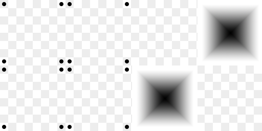
One of the most commonly used UV Grid patterns are dots meeting at grid corners, arrows, and custom shapes. In this tutorial, we’re focusing on dots, diamonds and a custom shape. The workflow for all of this is fairly generic, so if you want to do something different out of the gate, it's easy to adapt from the tutorial's text. diamond gradient is especially handy on organic shapes, as the soft edges easily show distortion if present. And it’s probably the fastest thing to set up as well
Creating a Dot pattern
- Create two layers – call them 32 and 256. Fill them with the checkers of the same size– we’ll be using these as placement guides for the checkered pattern
- Press U to activate Shape, and select Ellipse
- Set it to be filled with black
- Create a circle by placing it on the lower right side of the first 32x32 tile under the left 256 tile. Holding shift, draw your shape from the lower right to the upper left of that square.
- Make sure the circle is 16x16 pixels. Photoshop will show you the circle’s size as you go.
- Once you’re done, hit CTRL + T to transform, and scale it down 50%
- We now have a perfectly aligned 8x8 dot which will be perfect for checking stretch and alignments.
- Rasterise the layer and press CTRL+J to duplicate it
- Hold Shift and move it down, to where the grids meet at the 248 horizontal and 8 vertical
- Center the circle. Once you’re done, press CTRL+ E to merge
- Press CTRL + J to duplicate and move the circles to where the right horizontals and verticals meet.
- Press CTRL + E to merge and CTRL + J to duplicate. Move the duplicated layer to the upper right quadrant, and align it with the guides on the horizontals and verticals
- Make the 32 and 256 layers invisible
- Define as Pattern and call it 256 Black Dots Solo
- Press CTRL + E to merge down. Press CTRL + J to duplicate
- Go to Edit ->Transform ->Flip Horizontal
- You should now have a set of dots that are aligned to all squares
- Press CTRL+ E and Define as Pattern. Call it, i.e. 256 Dots Dual
- Press CTRL + I to invert.
- Define as Pattern – call it 256 Dual white dots.
3 - Creating a diamond gradient
Make the 256x256 black checkers visible.
- Make the dot layers invisible
- Save your file
- Create a new layer
- Press M to activate selection mode, and select the upper right quad
- Set Brush to Gradient, make sure the gradient is set to black and white and the Gradient fill is set to Reverse and Diamond Gradient.
- Put your mouse or pen pointer where the 192 vertical and the 64 horizontal meet, and drag it up to the right where the 248 and 8 verticals and horizontals meet.
- This way you won’t have to rotate the diamond
- Either duplicate and move the layer to the lower left quadrant or rinse, repeat.
- Press CTRL+ E to merge with the other diamond.
- Make the checkers invisible
- Define as a pattern – i.e. 256 Diamonds
- Save.
4 - Creating a Custom Shape And Letters
As we’re using letters in the next step, it helps to have a background for these. It will – again – help spot distortion, as well as possible, just look cool, depending on how you choose to set this up. The tutorial creates a merged shape from standard Photoshop shapes, but I recommend you explore this, as you can get a lot of cool, and personalised results with this. We'll add letters to the top of the shape, as they will help navigate and also help finding stretch. We're defining letters as a pattern as well, to save ourselves a lot of duplicating and moving layers.
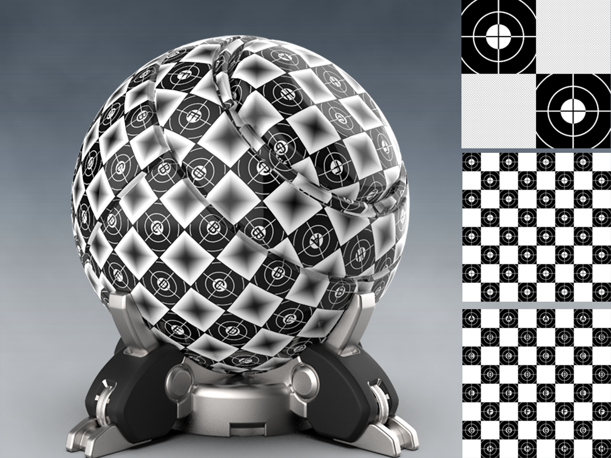
Creating a Custom Shape
- Make the 256 black squares layer visible again
- Press U for shapes, and select Custom Shapes
- Set foreground colour to Wite
- In the Shapes dropdown, select Registration Target 1
- Set it to fill, outline white and the outline to 2 px
- Place your mouse in the lower right of the left black quadrant and drag your mouse to the top left, making sure the middle of the Shape aligns on the 64 horizontal and verticals.
- Rasterise the layer
- Go back to the Shape Tool and select Ellipse as your next shape
- Start in the lower right of the left quadrant again and fit the circle in the square
- Press CTRL+T and increase the shape size to 125% vertically and horizontally
- Align it to the middle horizontal and vertical 128 guides
- Rasterise the layer and press M to select and delete the bits that are outside the square
- Press CTRl? J to duplicate and move the duplicated layer down to the lower right black square.
- Align, press CTRL+ M to select and delete the superfluous bits on top and on the left
- Press CTRL+ E to merge down
- Make the black squares layer invisible
- Define as pattern, i.e. 256 Target
- Save file.
Creating a letter fill
- Create a new file, set it to 256 wide and 1024 high, and Transparent
- Save it as Letters
- Create a Group, call it Background
- Create two layers: 256 and 256 Target
- Ensure 256 is under 256 Target, and fill 256 with 256 checkers and the 256 Target Layer with 256 Target
- Create two vertical guides – one at 64, the other at 192 – they should align with the middle of the Targets
- It is of course entirely up to you which font you pick – I picked DIN Medium Regular set to Caps and set it to 48 pts so it would fit inside the Target
- Create letters from A to H
- Align A, C, E, G on the left by first pressing V to access the Move tool – and then press the Distribute evenly tool, as well as the Align Left tool. Do the same for the B, D, F. H row on the right
- Merge all layers, hide the checker and target group, and Define Pattern – i..e DIN Medium 1024 Tile
- Hit CTRL+ Z to undo the rasterization and save file
5 - Creating the Numbers
Needless to say, numbers also help with coordinates in addition to helping find issues. However, as numbers are not a repeating pattern, we are creating a 1024x1024 tile of coordinates for easier tiling. We are adding two sets of numbers to each number tile. Some people prefer the same coordinate top and bottom, others prefer the top number to be the column, and the bottom number for row. The video does the former, this tutorial and the action belonging to the tutorial the latter.
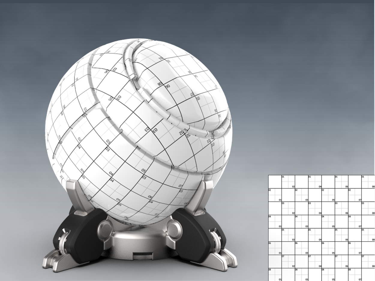
- Create a new file, set it to 1024x1024 and Transparent
- Save it as Numbers
- Create a Group, call it Background
- Create two layers: 256 and 32
- Ensure 32 is under 256, and fill 256 with 256 checkers and the 32 layer with 32 checkers
- Create a new group, call it Numbers.
- It is of course entirely up to you which font you pick – I picked DIN Medium Regular and set it to 16 pts so it would fit in the middle of a tile on the 32x32 layer
- We’re going to set row number in the top left corner of every checkered quadrant, and the column number in the lower left.
- Press T for Text, and put 01 in the top left of the top left grey checkered square.
- Press CTRL+ J to duplicate it thrice
- Move the 01 into the top left each grey checkered square as shown below, select the text layers, and add them into a group named, i.e. Rows
- Duplicate the group for easier navigation, call it Columns and move each text layer into the lower right quadrant of each chequered square, and set the numbers to 02, 04, 06. 08 shown below.
- Duplicate the Rows group into the second row, and set the top numbers to 02
- Duplicate the Columns group and move the text so it matches the grid, setting the numbers to 01, 03, 05, 07
- Duplicate both rows and both column groups, and move them down. Set the row numbers to 03 an 04
- Duplicate both rows and both column groups, and move them down. Set the row numbers to 05 and 06
- Duplicate both rows and both column groups, and move them down. Set the row numbers to 07 and 08
- Merge all groups
- Save
- Hide the chequer group
- Define Pattern
6 - Creating the Actions
All done. All that’s left to do now is to define the actions. Before we create them, make sure the Actions panel is active in your UI, if not, activate it by selecting it under Windows. Remember to create a group for your actions and add the actions into it. If you are completely new to recording actions , you create a new action by pressing Create New Action icon at the bottom of the Actions menu, and you the start recording by pressing the white dot. It will turn red. You stop recodring by poressing the white square next to the red recording dot. We'll first create the base grid action, then a different pattern with a simple gradient, and then a different pattern again with a more colourful gradient. Below are the sample files from the Photoshop Pattern and Action files
Please note: It's entirely up to you which patterns and gradients you pick - the Action generating process is the same.
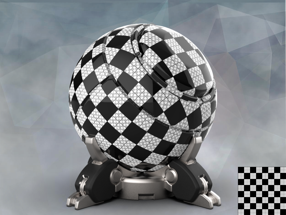
Basic UV Grid
- Click the group icon to create a new set of actions, and call it UV Grids
- Create a new Action.
- Call it Basic UV Grid 1024x1024
- Start Recording
- Press CTRL+ N to create a new document
- Call it Basic UV Grid 1024x1024
- Set it wo 1024 x 1024
- Set it to Transparent
- The new document will open with a new layer. Call it Background Colour for Grid
- Create a new group. Call it Checkers
- Create four new layers. Call them 32, 64, 128. 256
- Fill 32 with the 32 checker pattern,
- Fill 64 with the 64 checker pattern,
- 128 with the 128 checker pattern,
- 256 with the 256 checker pattern,
- Create a new group, call it Grid
- Fill 32 with the 32 Grid pattern,
- Fill 64 with the 64 Grid pattern,
- 128 with the 128 Grid pattern,
- 256 with the 256 Grid pattern,
- It will look messy
- Turn off the 64 and 128 Checker layers
- Press Stop
- One basic Grid ready to go
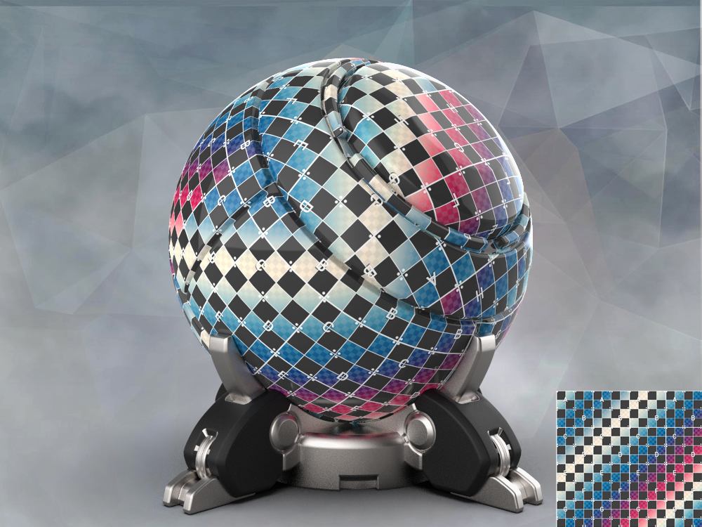
Grid with Simple Gradient
- Click the group icon to create a new set of actions, and call it UV Grids
- Close all open documents ( keeping it tidy)
- Create a new Action.
- Call it Basic UV Grid 1024x1024
- Start Recording
- Press CTRL+ N to create a new document
- Call it Basic UV Grid 1024x1024
- Set it wo 1024 x 1024
- Set it to Transparent
- The new document will open with a new layer. Call it Background Colour for Grid
- Go to Paint and set Paint to Gradient.
- Go to Gradients, and Select Color Harmonies 2
- Choose Append
- Pick the Red Blue White Gradient and set gradient to Linear gradient
- Drag the gradient line from the top left to the bottom right
- Create a new group. Call it Checkers
- Create two new layers. Call them 32, and 128
- Fill 32 with the 32 checker pattern, ,
- 128 with the 128 checker pattern,,
- Create a new group. Call it Shapes
- Create two new layers. Call them Dots and Letters
- Fill Dots with the Dual White Dots pattern, ,
- Letters with the Letter pattern.
- Set the Letters layer to have the Basic Drop Shadow style to crisp them up a little
- Create a new group, call it Grid
- Fill 64 with the 64 Grid pattern,
- 256 with the 256 Grid pattern,
- Press CTRL + I to invert the 256 layer, turning it white
- Press CTRL + I to invert the 64 layer, turning it white
- Press Stop
- One basic Grid ready to go
- Test and fix the action
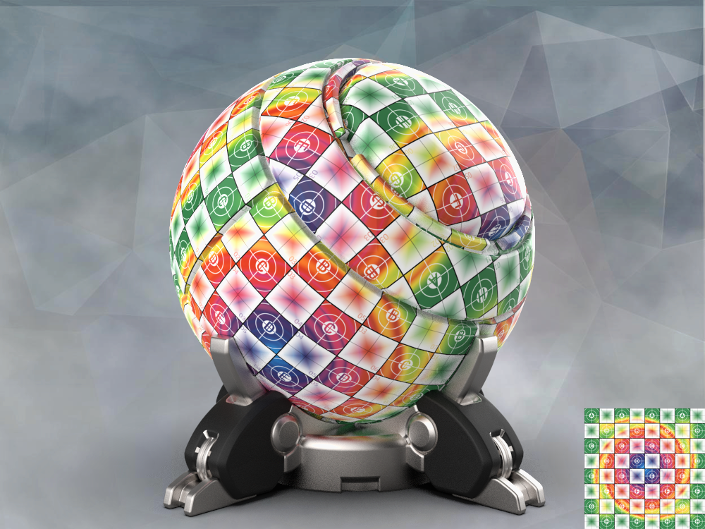
Grid with Twirled Diamond gradient
- Click the group icon to create a new set of actions, and call it UV Grids
- Close all open documents ( keeping it tidy)
- Create a new Action.
- Call it Basic UV Grid 1024x1024
- Start Recording
- Press CTRL+ N to create a new document
- Call it Basic UV Grid 1024x1024
- Set it wo 1024 x 1024
- Set it to Transparent
- The new document will open with a new layer. Call it Background Colour for Grid
- Create a new group. Call it Checkers
- Create a new layers Call it 256
- Fill 256 with the 256 checker pattern, ,
- 128 with the 128 checker pattern,,
- Create a new group. Call it Shapes
- Create four new layers. Call them Diamods, Numbers, Target and Letters
- Fill them with their respective patterns
- Create a new Group. Call it Colours
- Create a new layer – call it gradient 1
- Go to Paint and set Paint to Gradient.
- Go to Gradients, and Select Color Harmonies 2
- Choose Append
- Pick the Blue Yellow Pink or any other gradient you like
- Set it to Diamond gradient
- Drag the gradient line from the middle to the top right
- Set the layer to screen
- Choose Distort under Filters, and set it to Twirl at 999
- Create a new group, call it Grid
- Fill 64 with the 64 Grid pattern, and set Opacity to 25%
- Fill 128 with the 128 Grid pattern,
- Press Stop
- One basic Grid ready to go
- Test and fix the action as needed
Bonus tips
- In later Photoshops, rather than cruising the web for cool gradients, go to Window>Extensions>Adobe Colour Themes. Load and pick colour combinations and apply them to your gradients. Learn how to use it here
- If you want to create a grid on a Hard 1K - (1000x1000) try the following setup:
- Create a 200x200 document
- Draw lines with the same thickness as the grid above, 1px on a 25x25x document, 2 px on a 100x100 document, 3 px on a 150x150 document and 4 px on a 200x200 document. Use the same sizes for your checkers
- If you want a finer grained grid, add additional steps and checkers:
- 1px line on a 8x8 grid, 2px line on a 16x16 grid, 3px on a 32x32 grid, 4 px on a 128x 128 grid, 5 px on a 256x256 grid, 6 pix on a 512x512 grid, 7 px on a 1024x1024 grid and 8 on a 2048 x2048 grid - and set checkers at the same resolutions
- For fan art or just some fun, use the logos from your favourite games. I have more Gears UVs on weapons than I care to admit
- Clients really love custom UV grids. But check out their logo gudelines
Creating the rainbow UV grid from the top image
- Run the Basic 1024x1024UV Grid action
- I deleted 128 and 64 in the Checkers group, and merged the 256 layer with a white background, and set it to Multiply. I did the same for the 32 checker layer
- In the Grid Layer, I did the exact same again, only I deleted the 256 and 64 layers
- I created a background layer under the checkers layer and set it to RGB 192, 192, 192
- This is really all you need for a colour layer that "pops" to this extent
- Create a group named Colour between Grid and Colour
- Create a layer in the Colour Group, and set it to Screen
- Grab one of the rainbow gradients from Gradients and apply - I had mine set to Angle gradient
- I then applied a Twirl from Filters>Distort
- And then I just added components I had set up from the Pattern file and tweaked to my liking
- I really like to use colourful UV grids with various patterns on organic shapes because they display best on even surfaces -which means distortion will show up fast

